
After months
of self-isolation, economic upheaval, unemployment, and unrest brought on by
the ongoing global pandemic, the street style has embraced Pantone’s fall 2020
colours at New York Fashion Week.
The colour
choices will reveal a lot about how the fashion industry is planning to
navigate its road to recovery and the shades designers are planning to use.
Trend
forecasting and colour consultancy ‘Pantone Colour Institute’ has provided a
sneak peek of the top ten standout colours, along with current takes on the
five core classics fashion week followers can expect to see as designers unveil
their next collections.
Also read: Kim Jones announced as Karl Lagerfeld’s successor at Fendi
Commenting
on the new colour shades, Leatrice Eiseman, Executive Director of the Pantone
Colour Institute told Dexigner, “Combining our desire for stability,
creativity, and more spontaneous design approaches, the colour palette for
Spring/Summer 2020 infuses heritage and tradition with a colourful youthful
update that creates strong multi-coloured combinations as well as energizing and
optimistic pairings.”
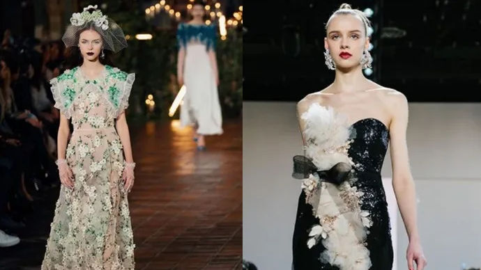
New York
Fashion Week that began on September 11 with a truncated roster of hybrid
digital presentations, intimate in-person events, live streams, has offered a
first look at how Spring/Summer 2021 collections will be experienced in the
coming months.
Even when
the future of the seasonal collection, dress-up fashion has been up for debate
during the ongoing pandemic, the impact of colours remains unchanged. Designers
will be seen using colours as a grounding force in their collections to attract
consumers.
From soft
yellow to aqua: below you will find examples of the predicted colour trends on
the runways following the colour chart provided by Pantone.
As per the sourcing journal, the pantone
describes PANTONE 14-1050 Marigold as comforting golden orange infused with
yellow, and PANTONE 13-0647 as offers “the promise of a sunny day.”
PANTONE
18-1248 Rust adds an earthy brown hue to the spring/summer lineup that is
reminiscent of autumnal leaves. PANTONE 16-1529 Burnt Coral can be your go-to
shade when you are confused.
Shades of
blue add a sense of calmness. PANTONE 15-4020 Cerulean mimics the colour of the
sky on a serene, crystal-clear day, while PANTONE 18-4140 French Blue is
described as “a stirring blue hue that awakens a vision of Paris in the
springtime.”
Also read: Kamala Harris is a sneakers fan; here’s a closer look at her shoe collection
Pantone
calls the colour green as a trend that is here to stay. PANTONE 13-0117 Green
Ash, “a mentholated green” cools and soothes. Similarly, a PANTONE 16-5938 Mint
can refresh and restore fashion.
We all need
some references of florals to make sprint/summer better. PANTONE 18-2043
Raspberry Sorbet brings a tantalizing effect, Pantone stated, while PANTONE
17-3628 Amethyst Orchid “introduces a unique touch” and purple-tinted
alternative to the vivid pinks that have dominated women’s fashion for several
seasons.
Which is your favourite colour, let us know in
the comments section below.


