
As a part of its new campaign to end the stigma associated with menstruation, Pantone launched a new shade of red inspired by the colour of menstrual blood. With this, it joined a growing list of companies that have taken cognisance of a long-existing problem.
Pantone, which is the biggest colour matching system in the world, collaborated with Swedish menstruation products brand Intimina to launch the campaign, which is called ‘Seen + Heard’.
Also Read | Rajasthan Royals partners with personal hygiene brand Niine to break stereotypes
Intimina executive Danela Žagar said that in pop-culture, the depictions of periods have ranged from wildly inaccurate and unsympathetic to being the subject of jokes and derision. She said that it has historically been treated as something that shouldn’t be seen or talked about publicly.
“We aren’t just painting walls,” Intimina says in a blog post, “we’re breaking down the ones that contribute to the stigmas surrounding periods. ‘It may be the 21st century, but attitudes around menstruation are long outdated and preserved by perpetuated cultural taboos that are mysterious, shameful, and the butt of many jokes.”
Also Read | Zomato announces 10 days menstrual leave for employees
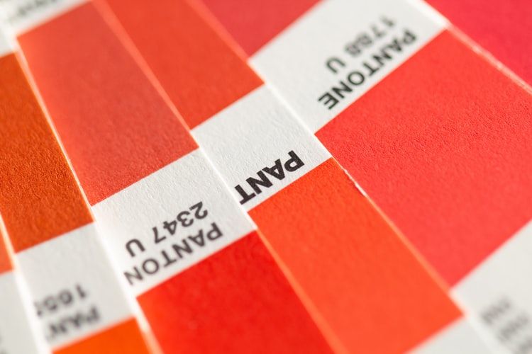
The new shade named ‘Period’ is “an active and adventurous red hue” that the company hopes would “embolden people who menstruate to feel proud of who they are”.
The Pantone system was devised in 1963 in the US to solve the problem of complicated colour matching in the printing industry.


